
Project name.
DE-Assistant
My role.
concept, design, UI, research
Tools.
Figma, Google survey, Figjam, pen & pencil, moderated usability tests
Execution.
2023, 3 months
Project overview.
What?
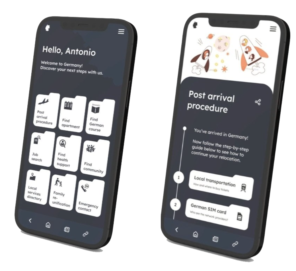
An assistive application that guides expats through the steps of relocation in Germany. It targets to smoothen the settling-in process and reduce misinformation during communication with local authorities.
For whom?
Expats who immigrated to Germany with a work visa. Who are of non-German ethnicity and uses English as the main or secondary language.
How?
By breaking down complex procedures into clear, concise steps. By acting as a “local services directory” by providing essential information on where to locate resources.
Part 1. Define & research
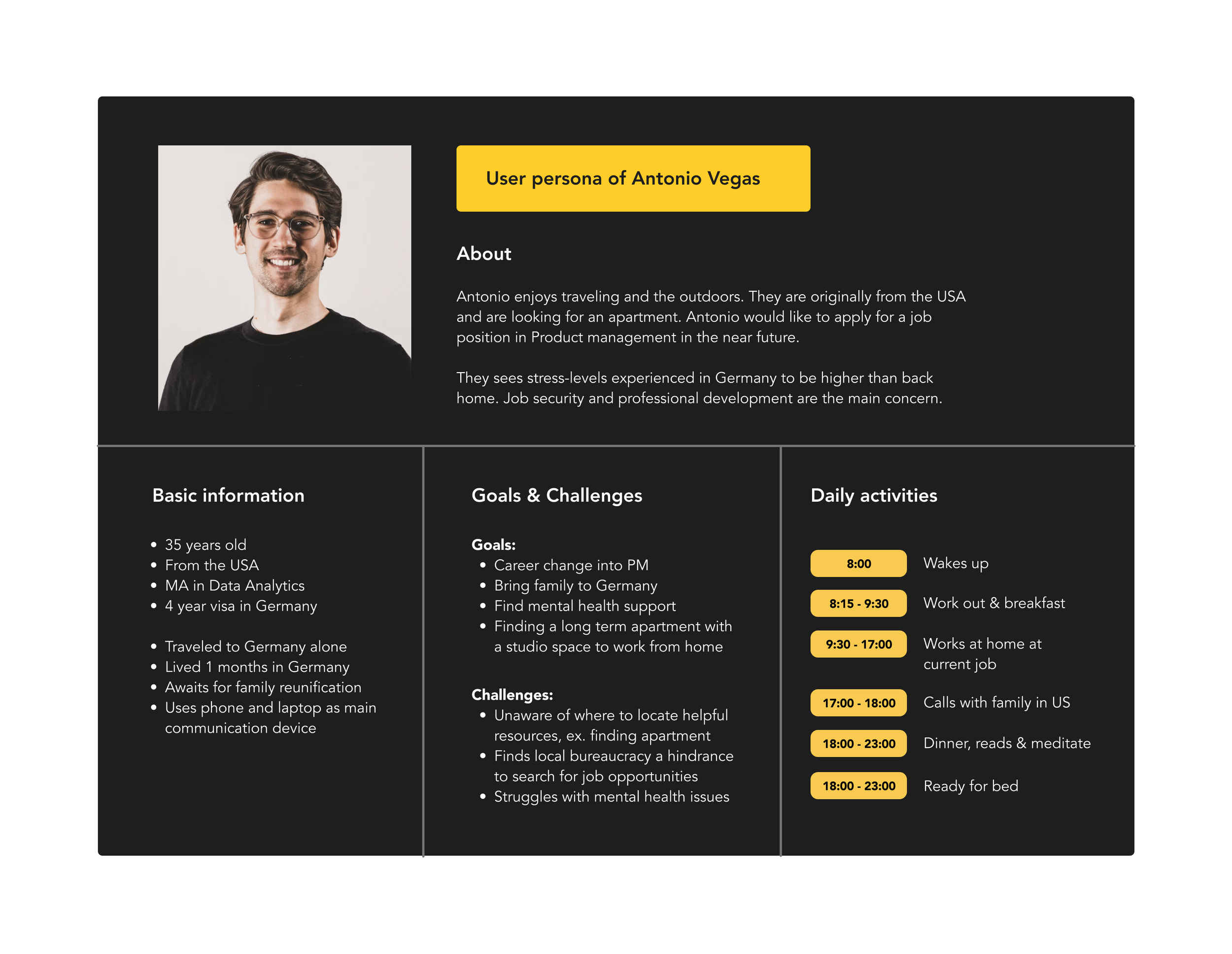
User Persona
Photo by Alexander Hipp on Unsplash
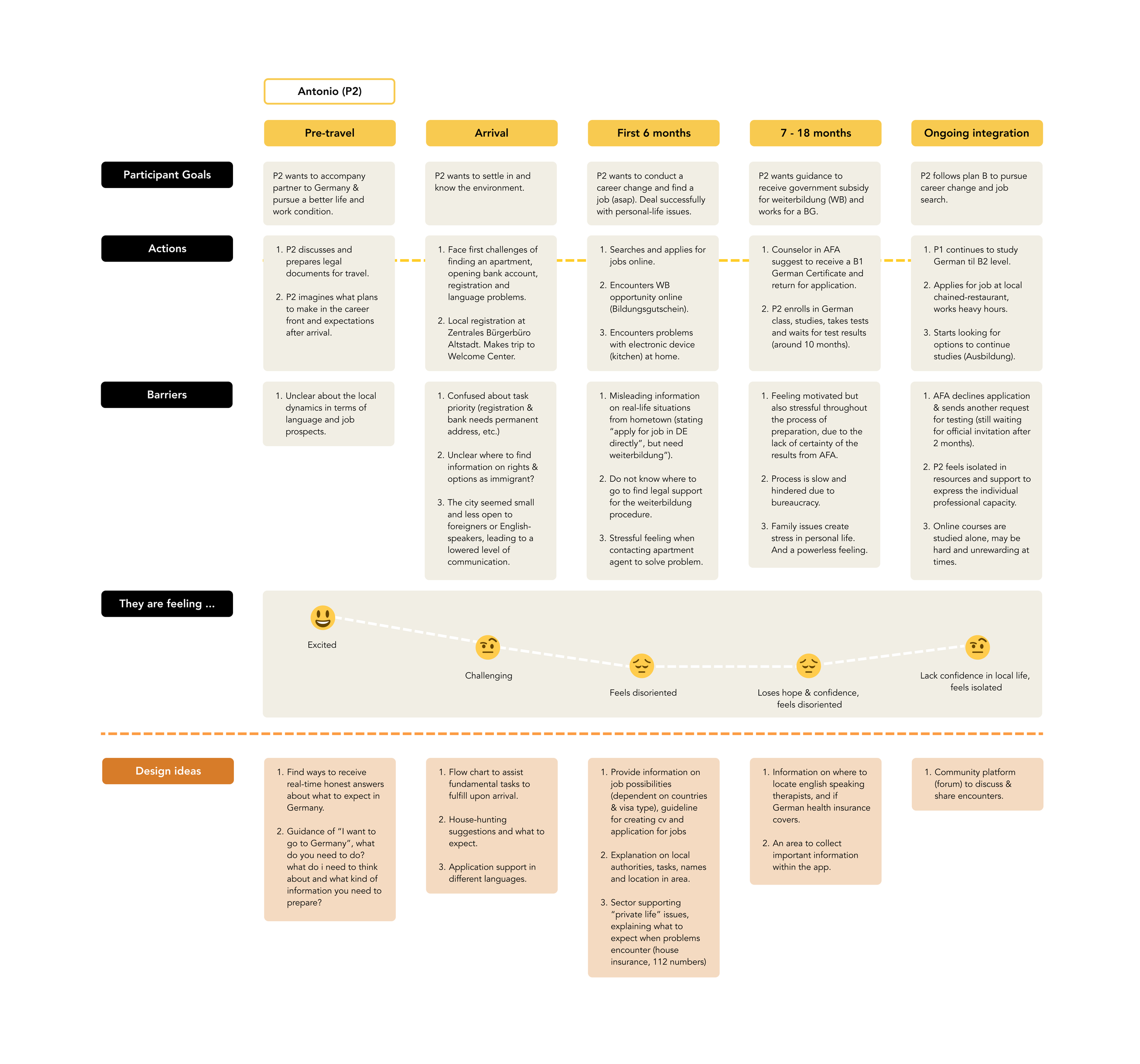
User Journey map
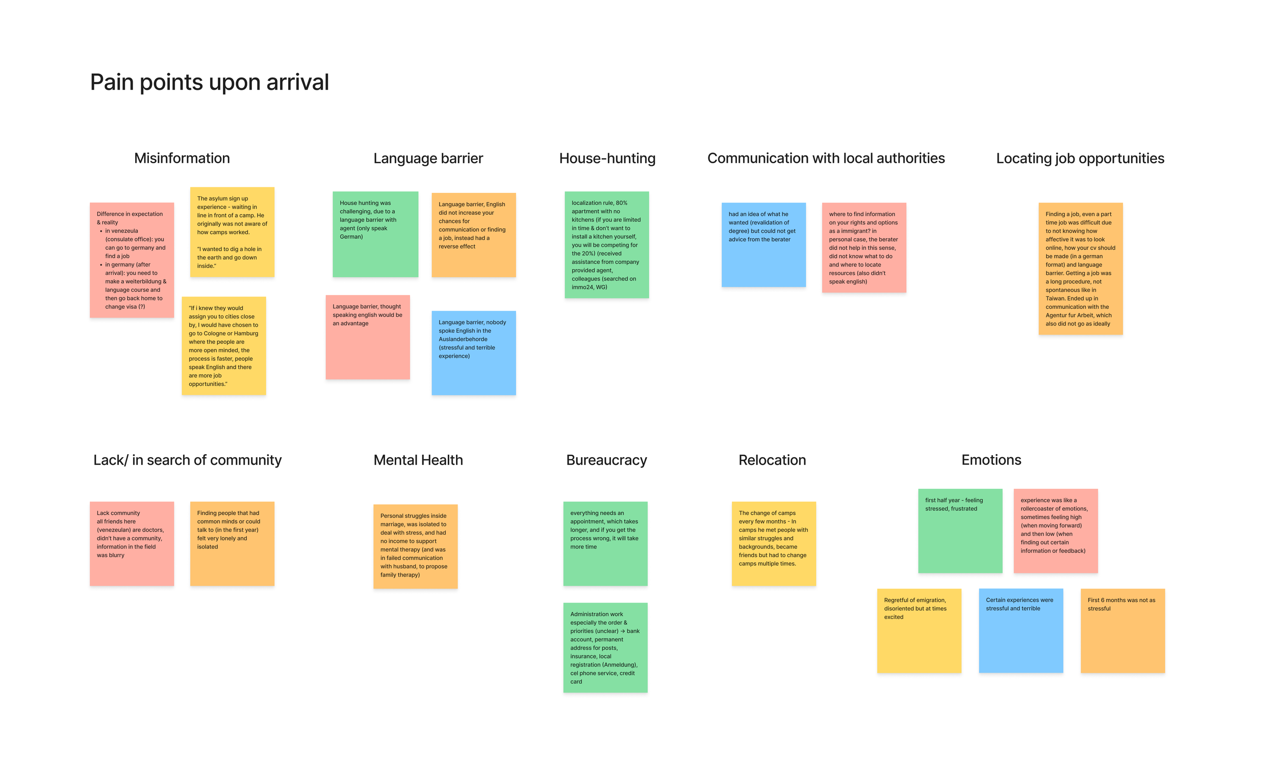
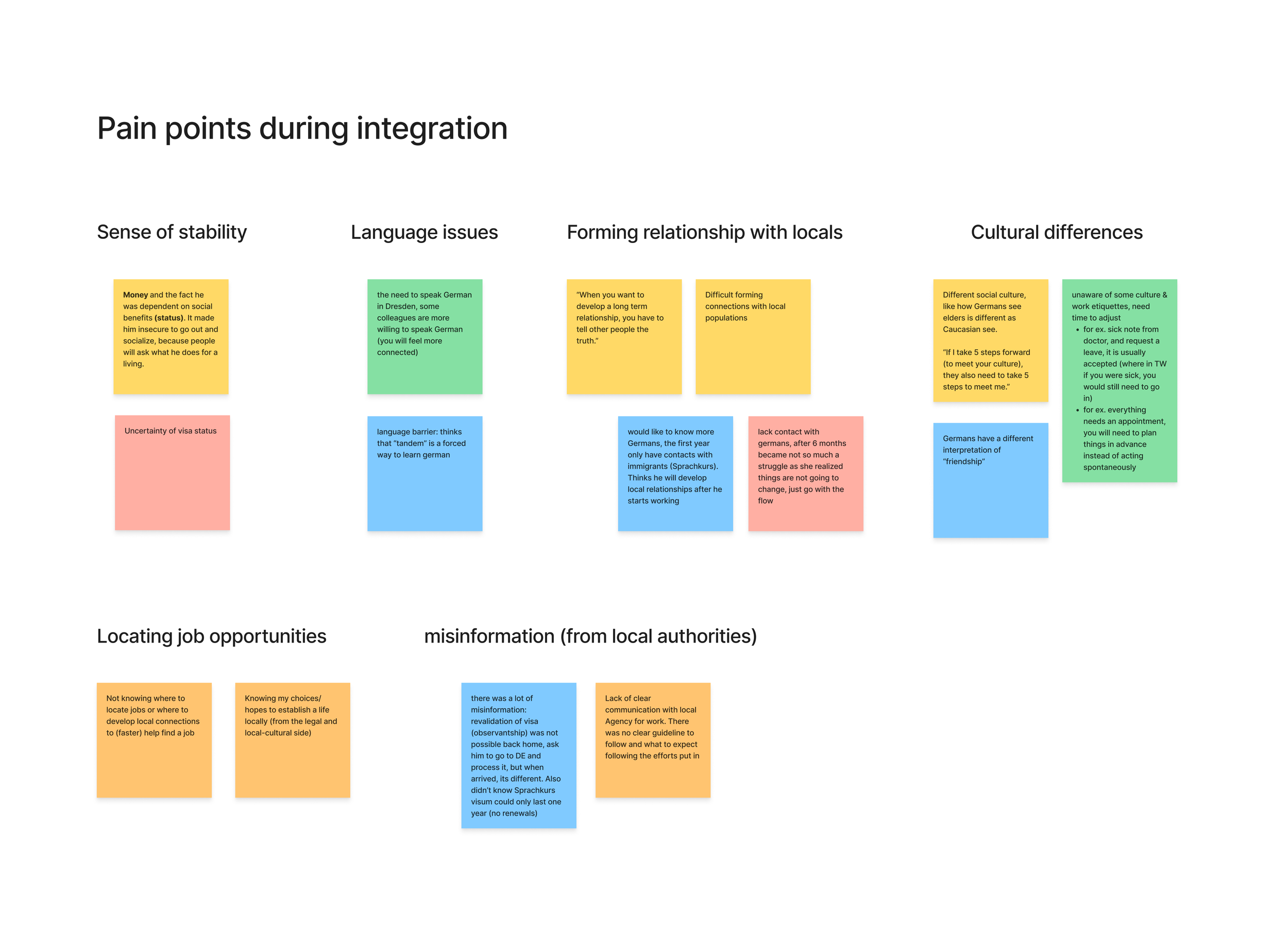
Defining user pain points (through interviews)
Defining user pain points (through survey)
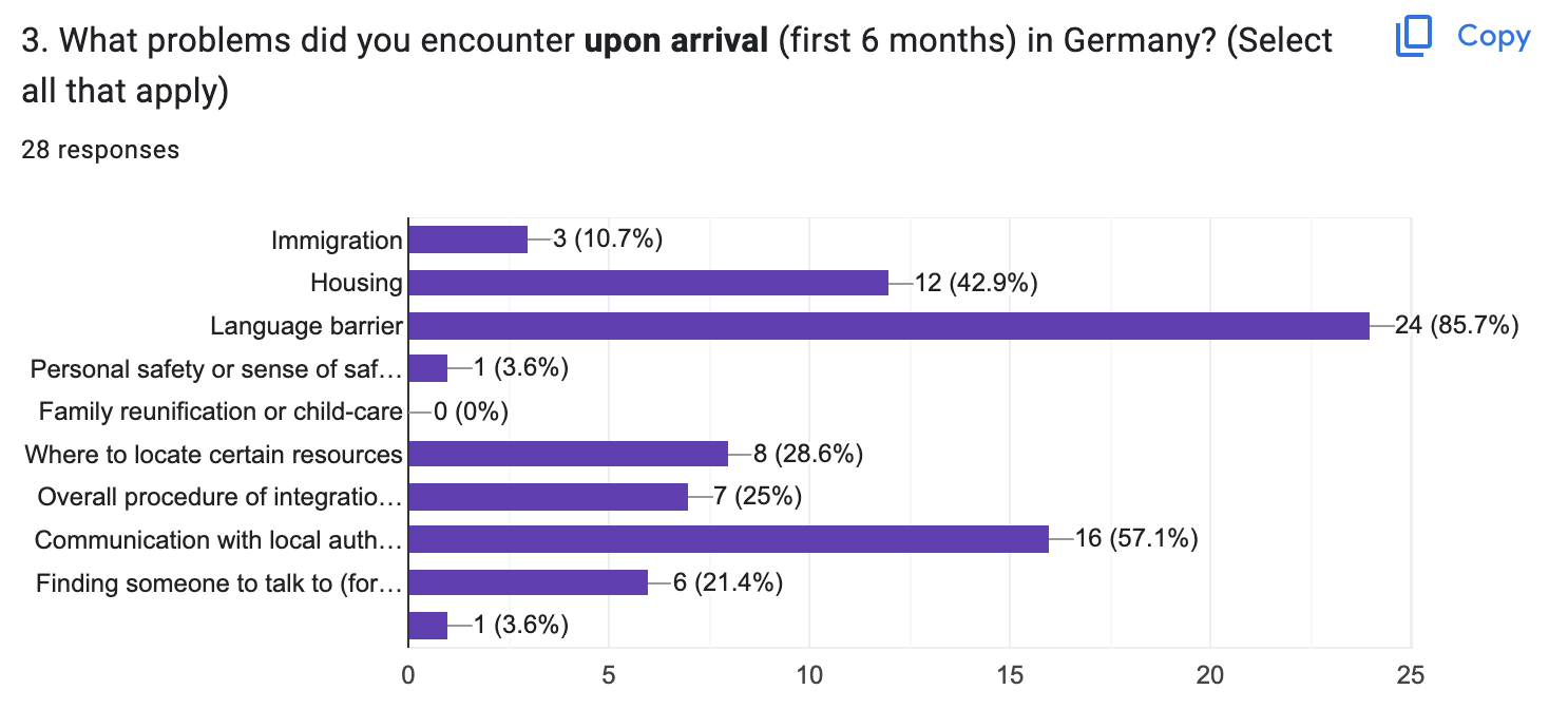
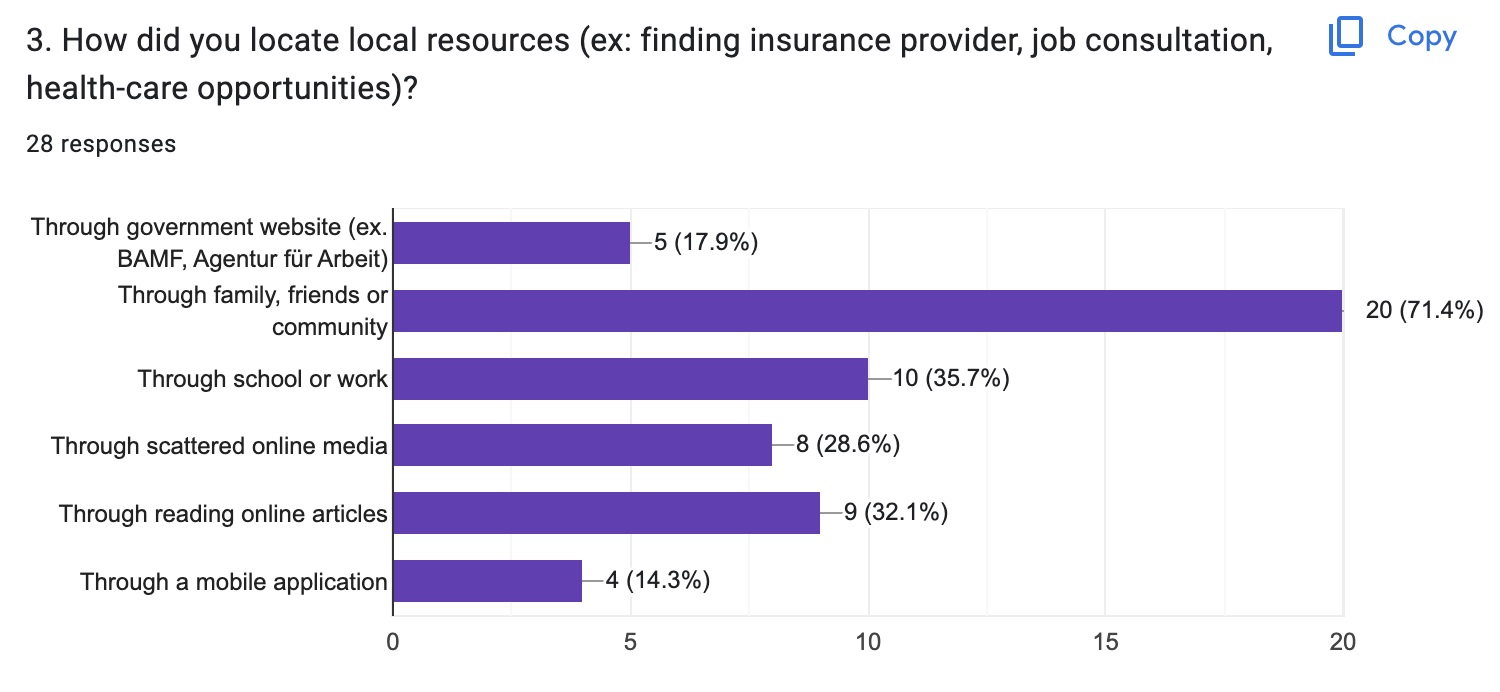
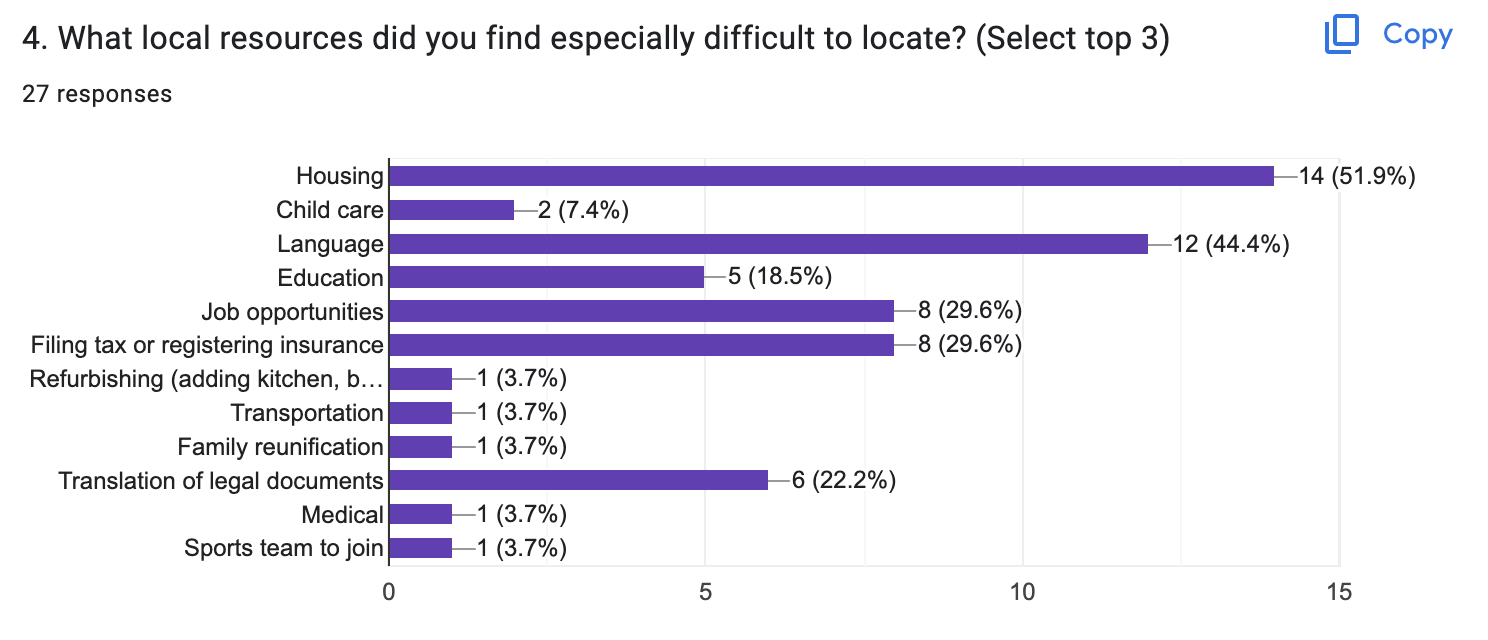
During the kick-off interview and survey, participants expressed the common pain points of relocation to Germany as:
having a language barrier
encountering misinformation during bureaucratic procedures
difficulty communicating with local authorities
while experiencing emotions of:
feeling stressful, overwhelmed and disoriented
a rollercoaster of unstable emotions within the first year
Read more of analysis in work log
User story
“As a progressive intellect and temporary visa holder who just moved to Germany, Antonio wants to find a suitable apartment and wants to career change into Product management in the near future, so they may provide a good future for himself and his family in the foreign land.”
Problem statement
Antonio is a career changer who needs assistance in finding an apartment, clarifying post-arrival procedures and how to reunify with his family because they are overwhelmed with the immigration journey and would like to stabilize their situation as smoothly as possible.
Hypothesis statement
We believe by utilizing an assistive relocation application (focused on clarifying procedures and locating resources), Antonio may execute their personal and professional decisions more smoothly, decrease the level of misinformation and help establish a stable life in a challenging foreign context.
Competitive audit
Competitive audit targets:
Canada PR (Canada):
main pros: has distinguished Pre-arrival and post-arrival sections, explaining steps of procedures
main cons: Homepage can be confusing, with tabs and information not in regular use taking up space of layout
Findhello (USA):
main pros: provides 9 categories of local resources, each with detailed info (address, phone number, direction)
main cons: info below search tab can be neglected due to too much overlapping colors and information
Refugiadas Climaticas:
main pros: incorporates creative storytelling, fun visuals and mapping
main cons: can be limiting in content, limits attraction for use
read more analysis in work log
Part 2. Design & wireframes
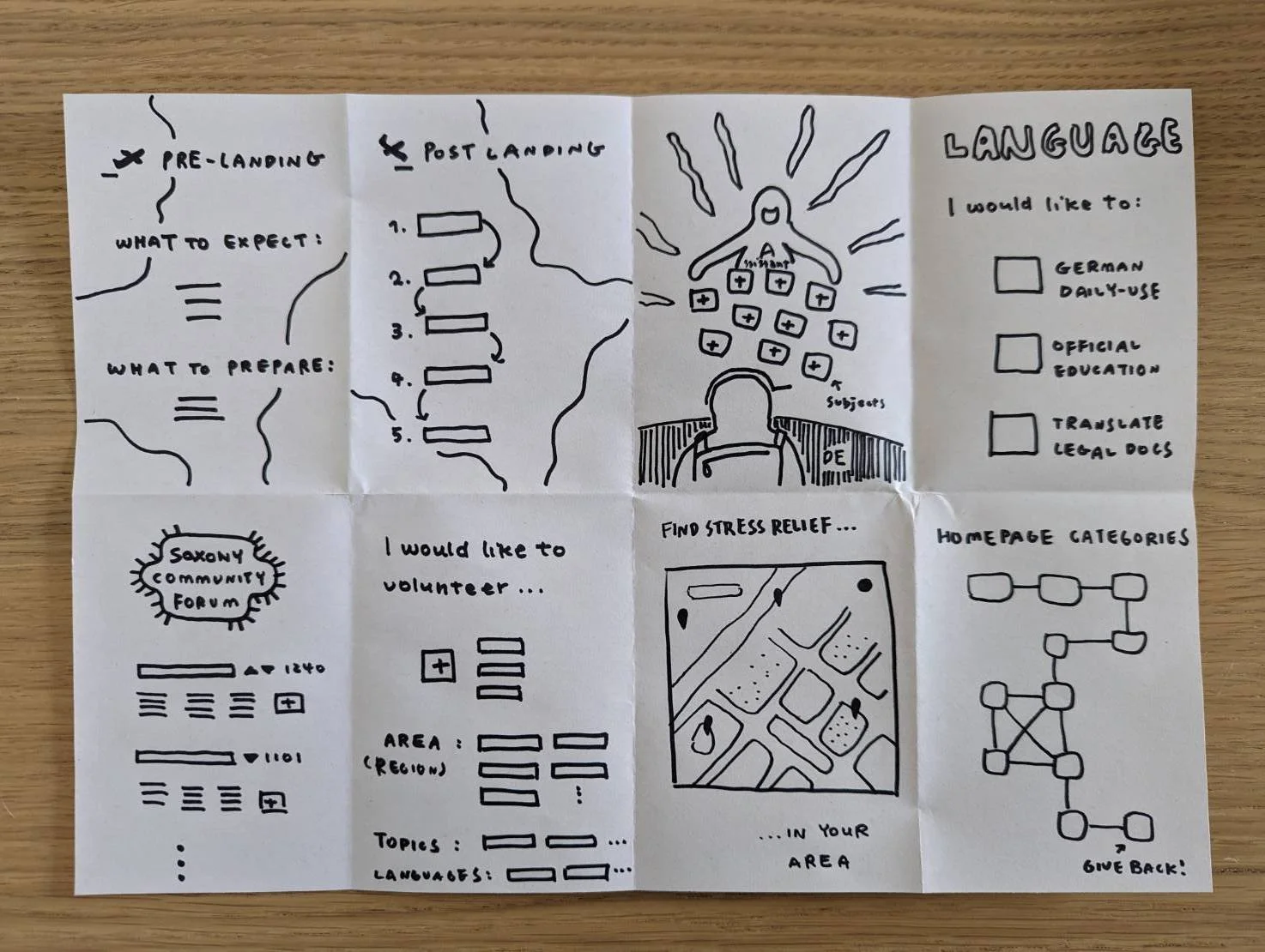
Crazy eights
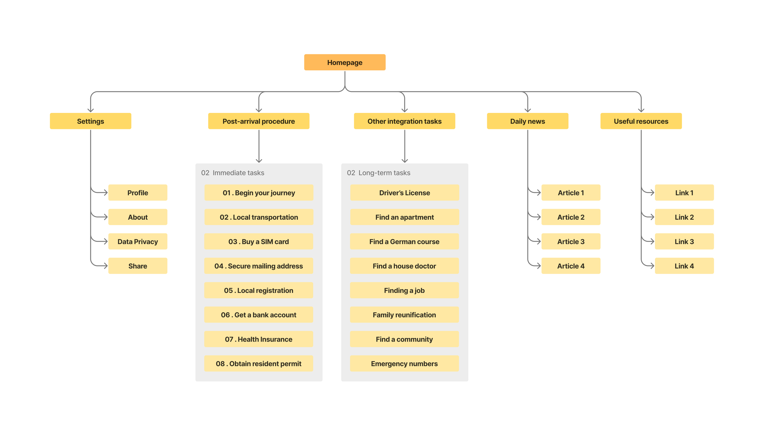
Information architecture
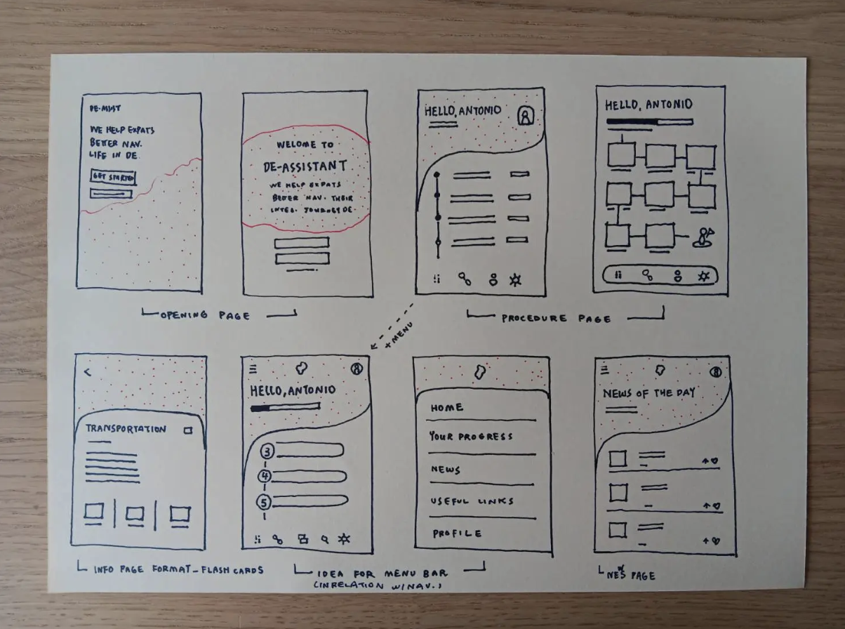
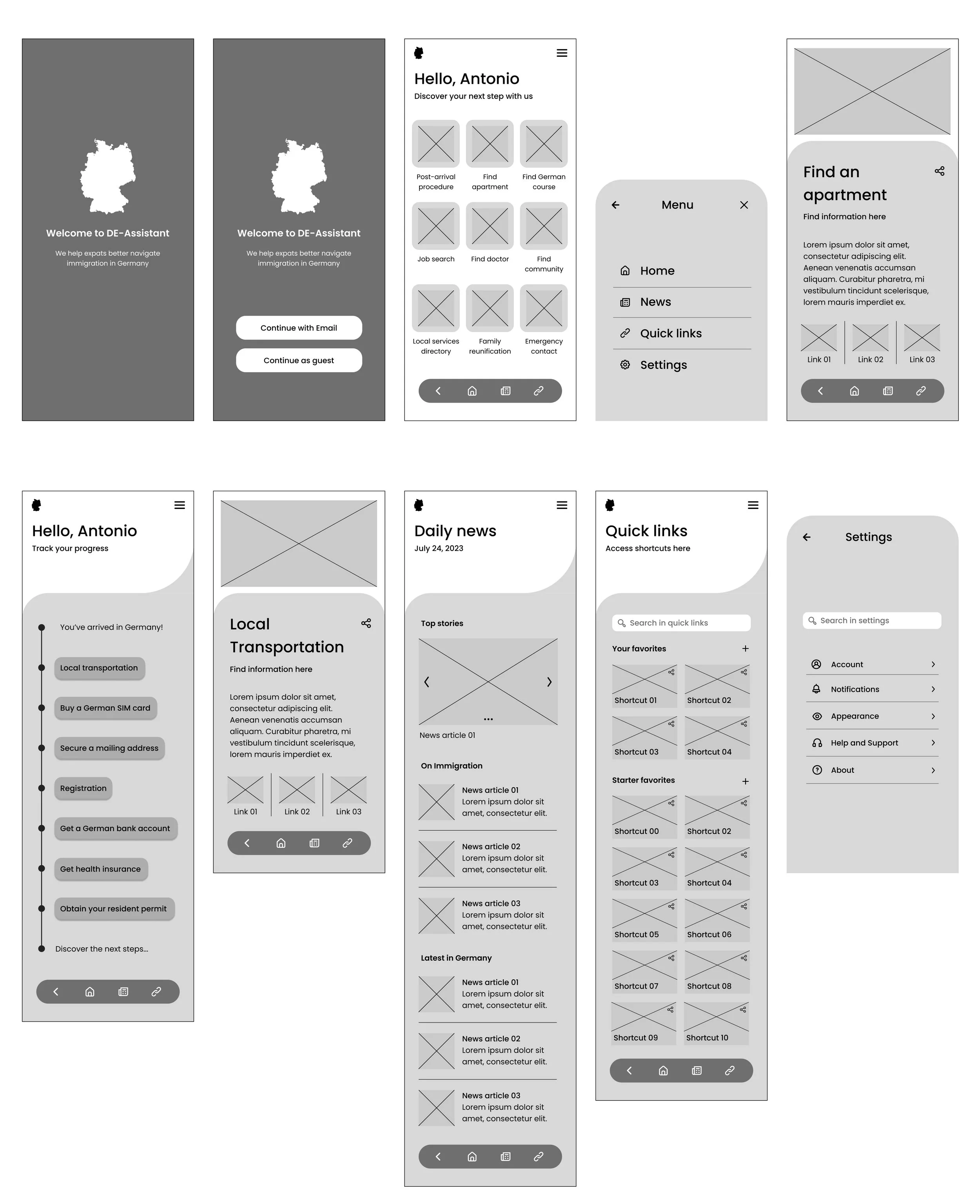
Low-fidelity wireframes - mobile screens
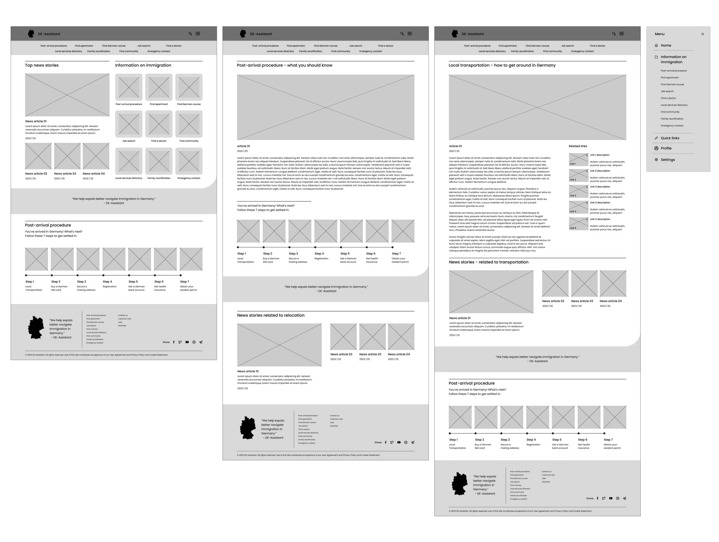
Low-fidelity wireframes - desktop screens
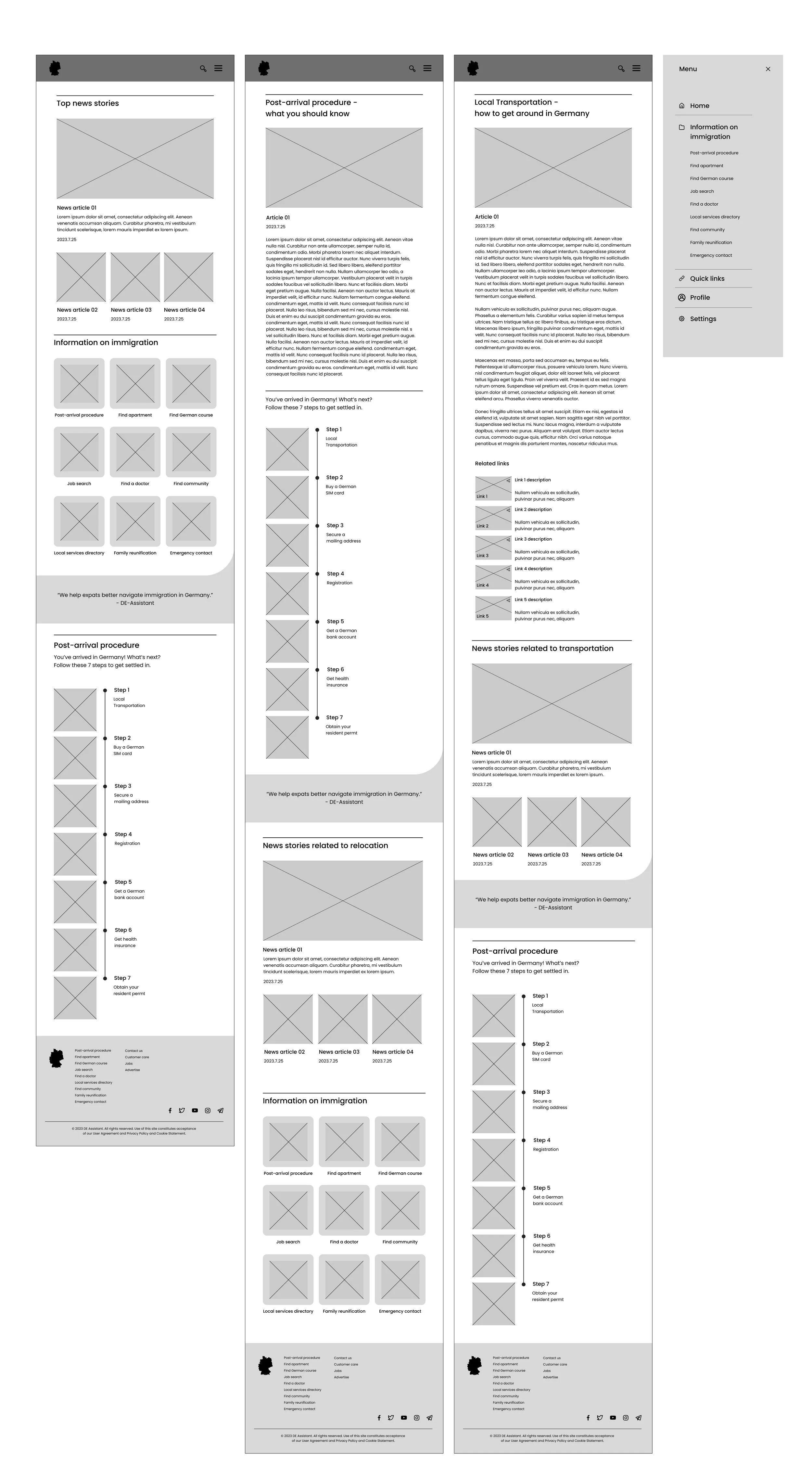
Low-fidelity wireframes - tablet screens
Read more on worklog
Usability testing - affinity diagram
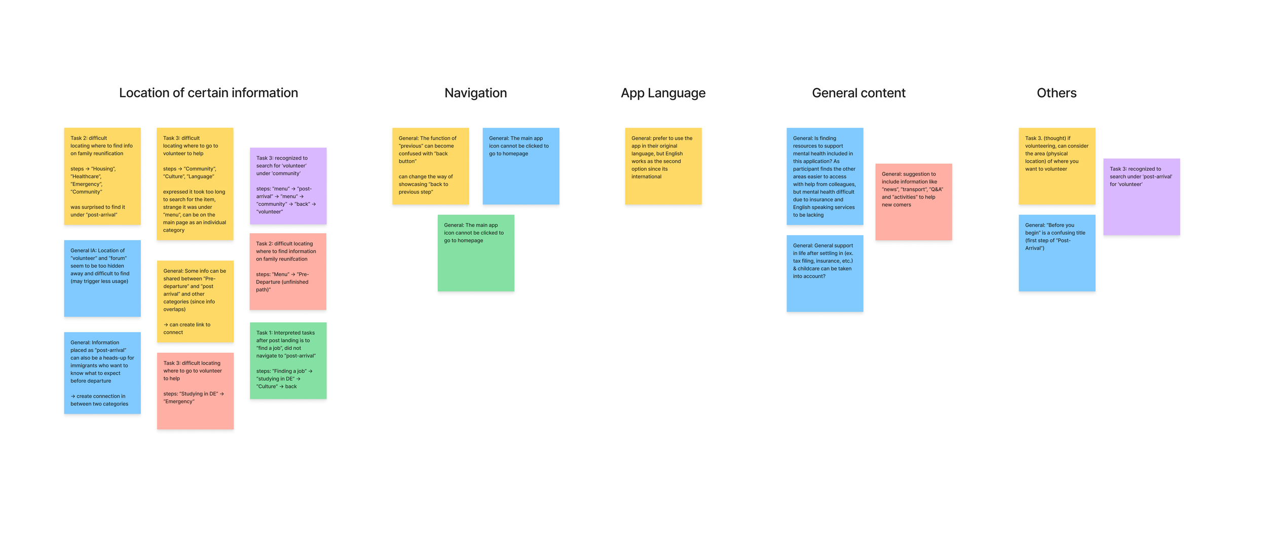
Tasks users were asked to complete in usability tests:
(1) locating where to go to find information after landing in Germany
(2) locating information on how to bring their family members to Germany
(3) locating where to volunteer to help other immigrants
Feedbacks that have assisted the iteration of the app include:
where certain information are located in the app, and how they are connected to each other
Missing information, like “News'“ and “transportation”
labeling of certain subject names
visual improvements made to distinguish from other governmental agencies, to become more engaging
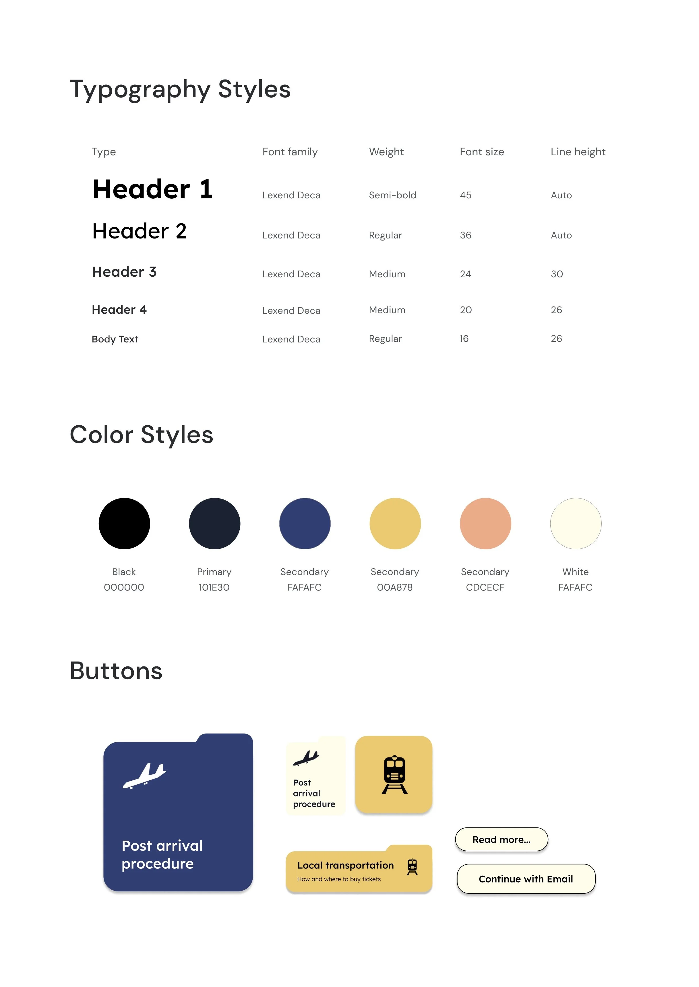
Design UI
Part 3. Responsive web design
& high-fidelity prototype
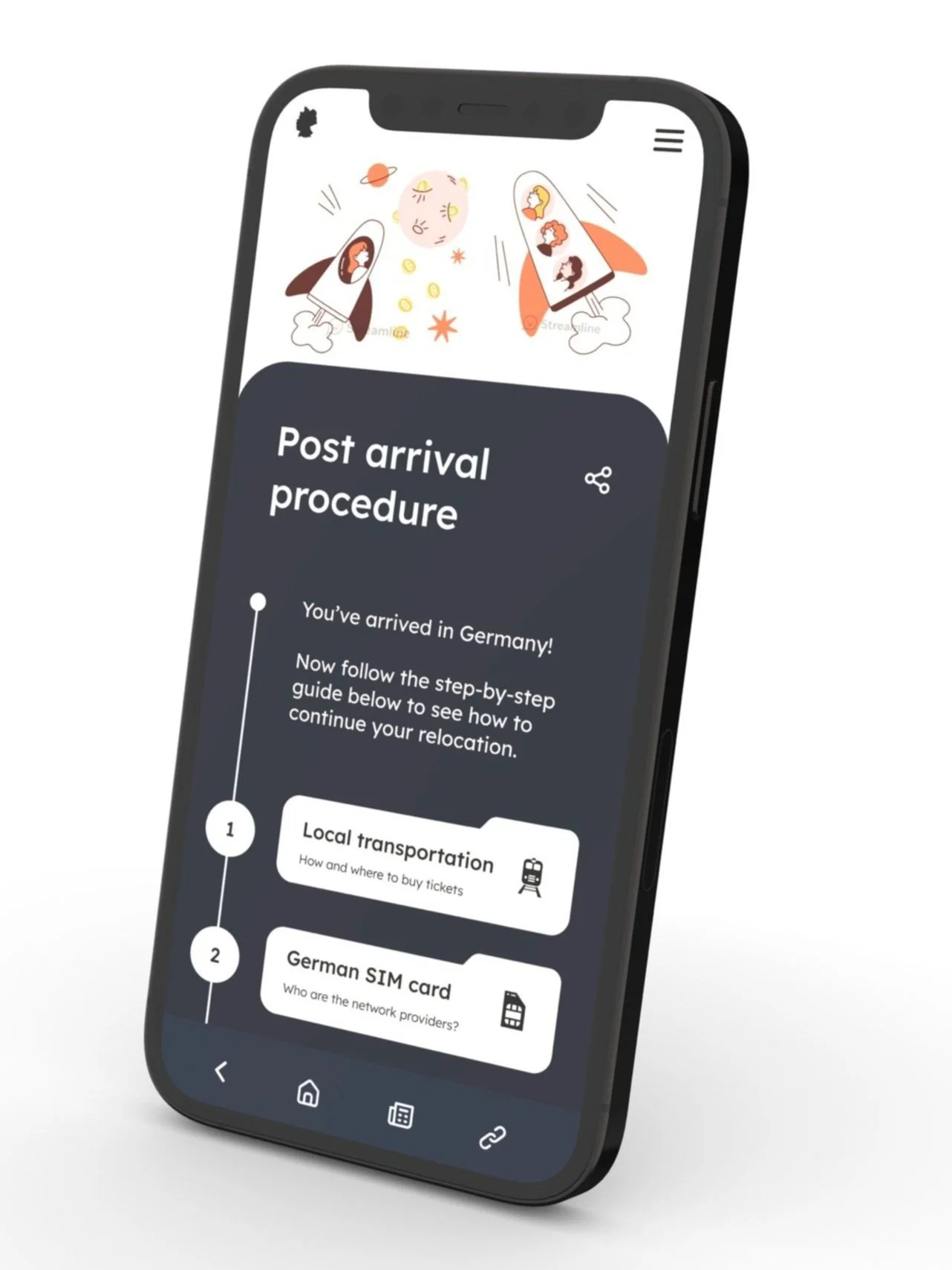
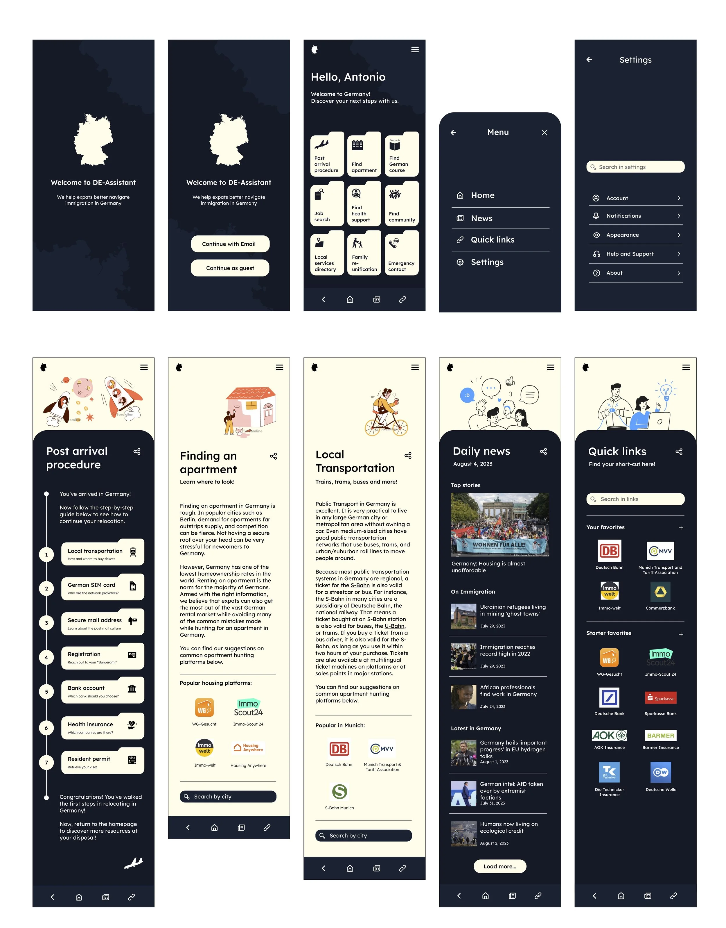
Mobile screen mockup
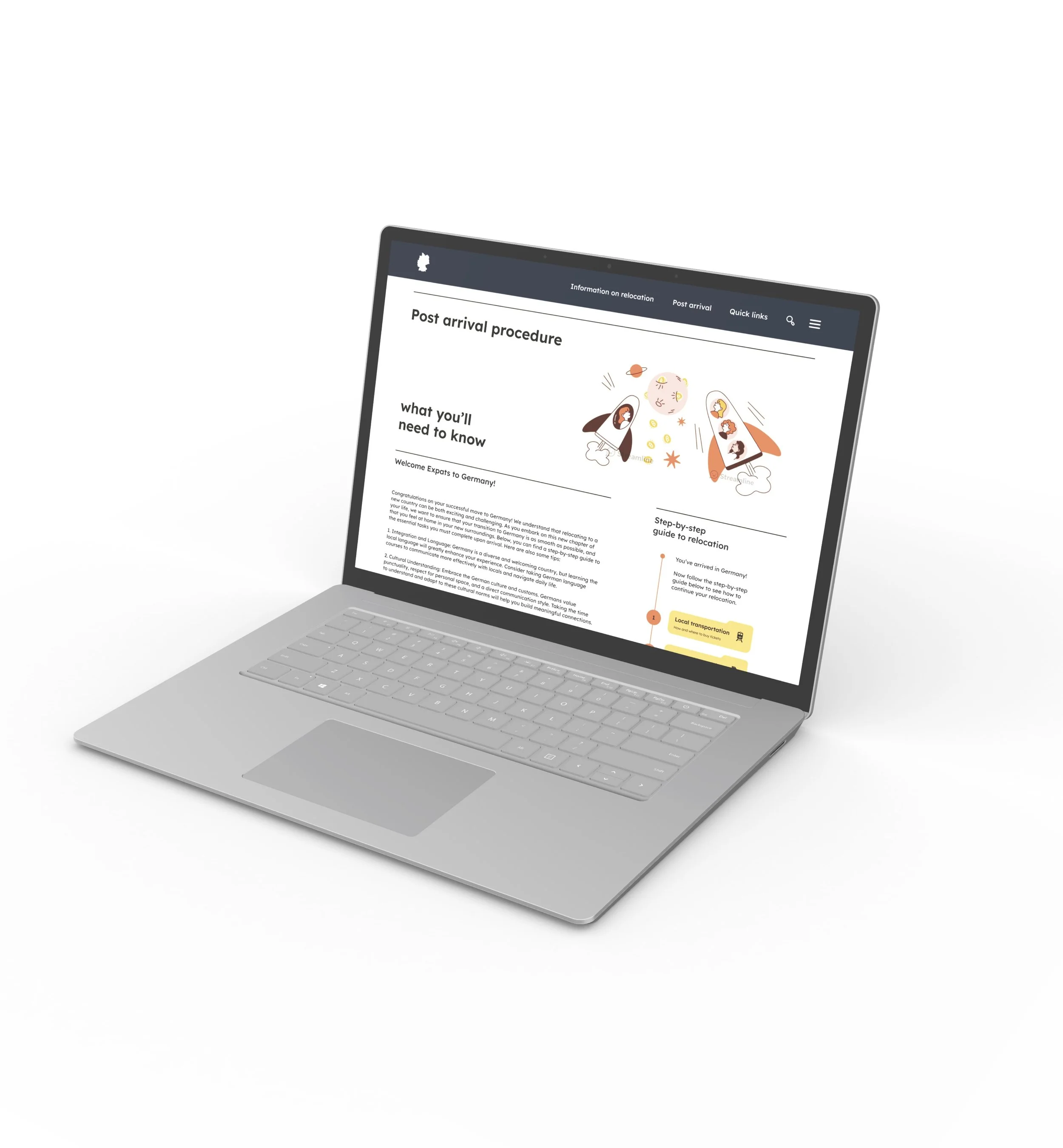
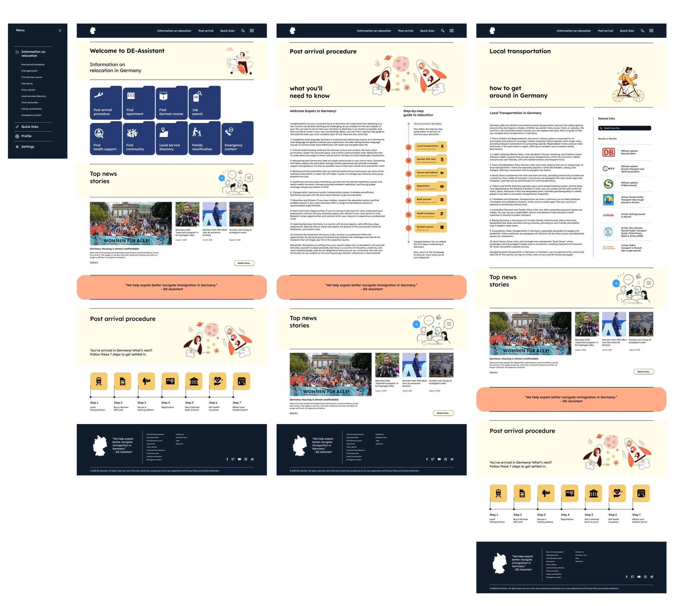
Desktop screen mockup
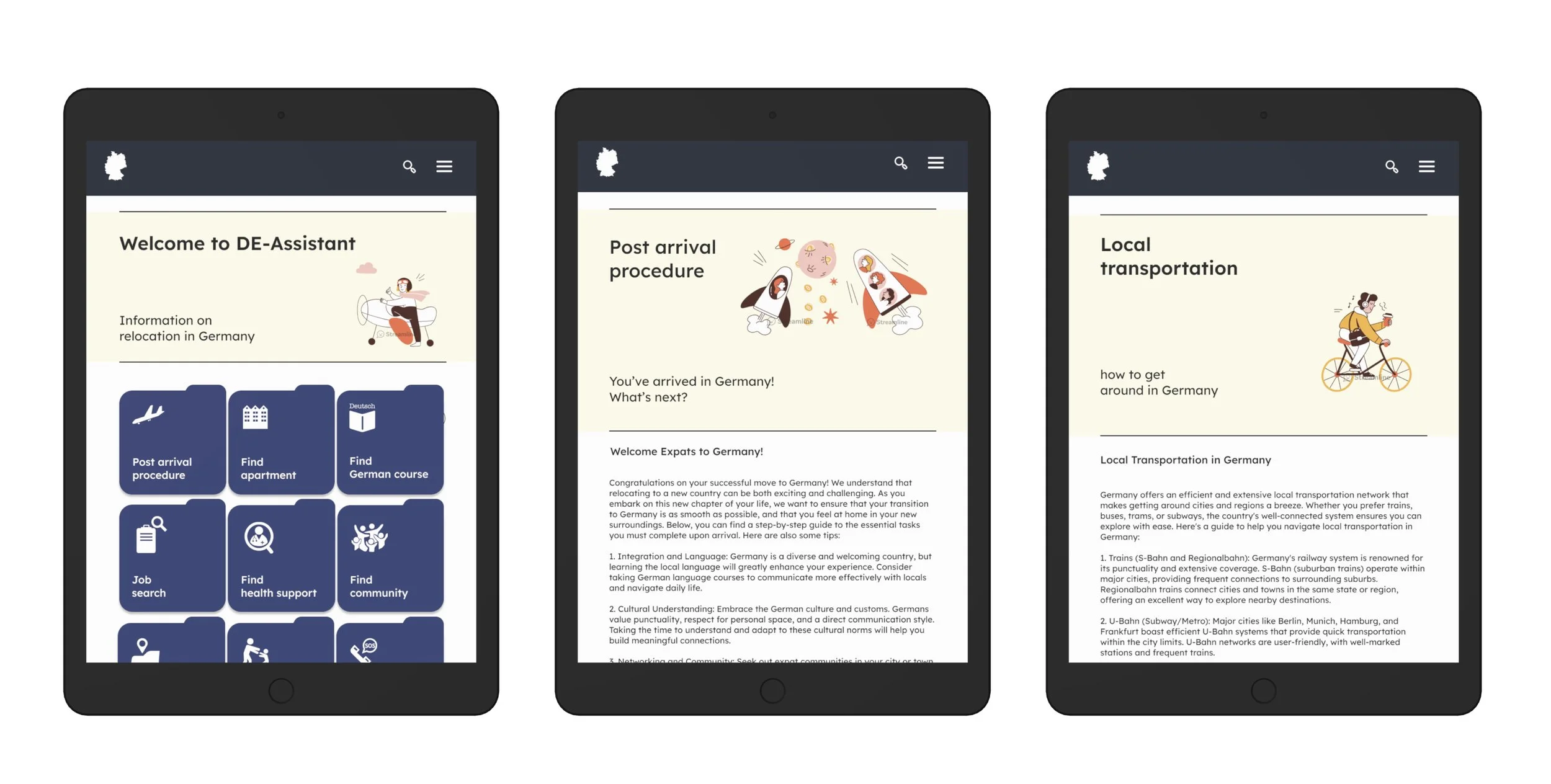
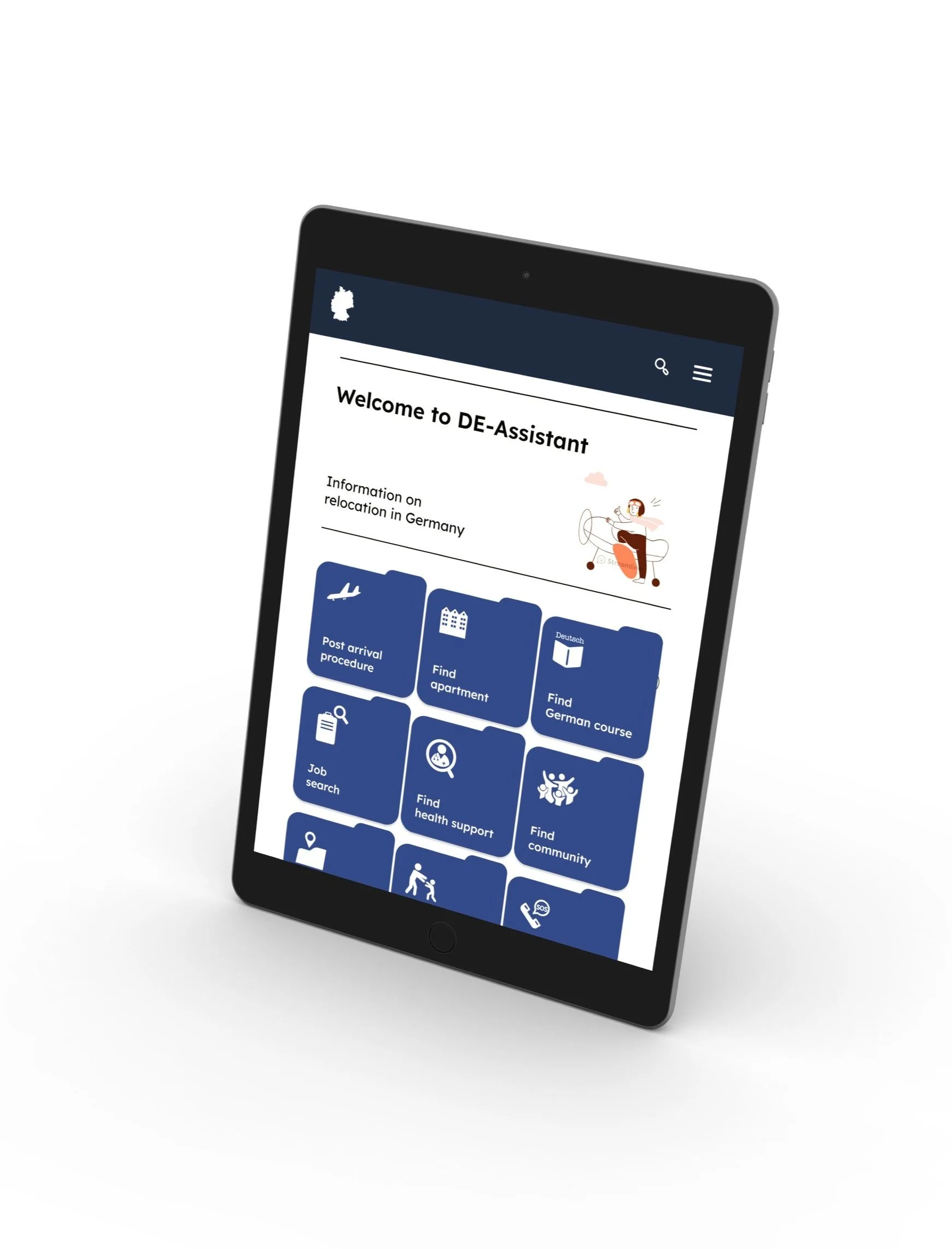
Tablet screen mockup
Mobile screen mockups
Desktop screen mockups
© Graphics by Streamline
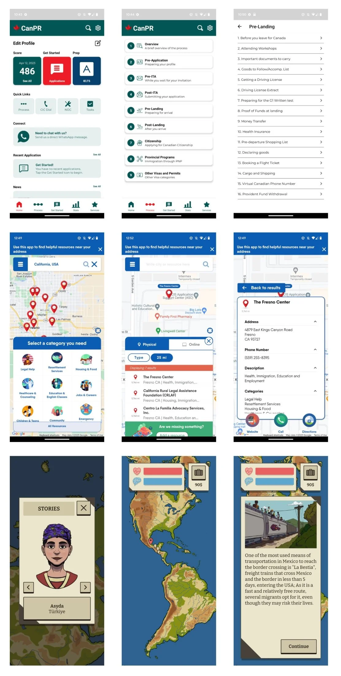
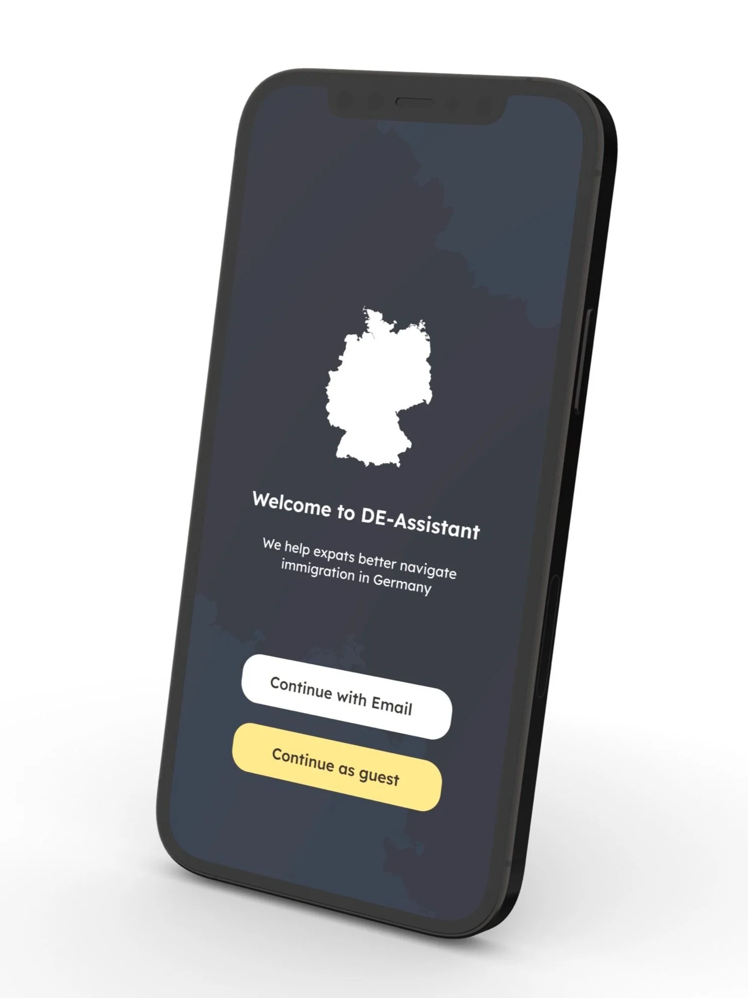
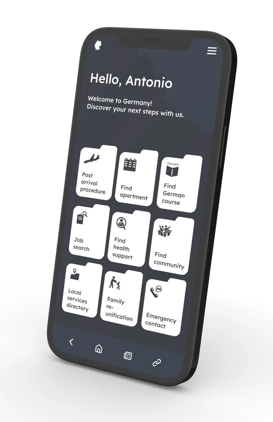
High-fidelity prototype - mobile screen version
High-fidelity prototype - desktop screen version
Part 4. Key takeaways.
What I’ve learned
The main takeaway during the development of the DE-Assistant application:
the importance of creating a non-bias space for discussion over a commonly shared challenge/topic
I realized, even as being an expat myself, every user’s experience and pain points may differ largely due to context of their background. It is crucial to avoid creating pre-determined presets when conducting usability studies and the detailed designs of the information architecture, as it may easily determine the structure and influence navigation.